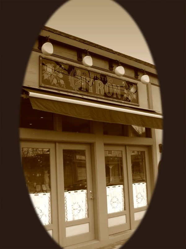
A lovely restaurant, Bistro Citron, in Roslyn, N.Y.
I thought it would look right in sepia because it has all the old-fashioned details. I added the oval frame using Adobe Photoshop's Quick Mask. This dark brown frame looked better than a white or a black one.
Thanks for joining us for Sepia Scenes today, Wednesday April 15 (income tax day in the U.S. - Yikes!). Feel free to post your Sepia Scene through today and all day tomorrow.

Please sign Mr. Linky and leave a comment.

30 comments:
Great choice! I thought initially that you'd shot this through a round window. Like the effect a lot. And the subject is perfect.
Looks like a great restaurant. I love the sign, and I love the effect you created.
Good morning, Mary. Love the look of the restaurant. I'll bet it's a local favorite. I like the frame you have presented it in as well.
Cool detail of the restaurant. Seeing it in Sepia makes me imagine what colors the doors are. My feeling is they are green.
Mary, this looks wonderful in sepia! The frame makes me feel like I am looking at one of those Magic Lantern projections!
Like Mojo, at first glance I thought it was captured through a window. Nice effects~
15th April is due date for taxes here too... *dreadful*
Lovely restaurant and it does sepia justice. I like the added touch of lace curtains.
Hello, teach Mary,
The sepia has given the picture a coherent look, enhanced the details and made the lemons place an inviting sight.
The oval framing adds a retro look, which is appealing.
I do love the way you are experimenting with always new details.
So inspiring.
From Felisol
I love this photo in sepia, and with the framing, it adds so much nostalgia to the lovely architecture.
It's like looking back in time...so beautifully done.
Nice choice for sepia. Love the way those old buildings look in sepia.
Haven't uploaded any of my UK holiday pics yet, so this week I delved into my 'backup' pics of Dowagiac for today's Sepia Scene: a Round Oak Stove finial @ It's A Blog Eat Blog World .
Enjoy!
~mo
That is a great choice! Happy SS,Mary!:)
Very lovely. I love old looking restaurants. Thank you for sharing.
Looks like you are peeking thru a keyhole. Lovely.
This bistro looks fine in sepia. The sepia makes this look old. Really, this could be a picture taken decades or even a century ago. It looks classic!
the oval frame directs your attention to the center , grest choice for sepia
Such a lovely street face on this restaurant! Fascinating and inviting! It certainly displays dramatically in that oval frame!
Neat subject for sepia, and I like how you framed the photo.
Happy Sepia ;-)
I think sepia is perfect for that photo and the framing looks good too. I love the oval frame. This is a "classy" looking photo!
Lovely subject - I especially like the reflections - the other storefronts seem to make great sepia subjects as well!
I'm off to visit....
LOL! We both have oval frame-work going this week Mary -- but that's where are similarity ends! I like that shot! Looks like a place I'd try!
That has a lovely old style feel to it.
That's nice restaurant. love the sepia look.
I like it!!! And I love the reflection in the window as well!
Mine is up now too, a bit late, perhaps, but it was worth working on some more.
I love this sepia scene and have become curious about the inside! Happy sepia scenes, everybody :)
This is my first time to join this meme. :-) Nice shot, by the way. I love the details of the window.
Hi Mary,
I really like your Sepia photo! And that oval frame sits it off really great! Mine is posted. Have a great day!!
Sherrie
love it in sepia, the details really come out
The bisto is lovely in sepia. I am guessing that I am too late to post my own photograph? It was my first for Sepia Scenes.
Keep up your wonderful work. Your images are a flight into the imagination. I love them!
Chloe gets the sepia treatment at Purrchance To Dream today, and at It's A Blog Eat Blog World it's two sepia-ized Salvador Dali sculptures from my trip to London.
Have a great sepia-ized Earth Day Wednesday, everyone!
Cheers,
Mo
Post a Comment