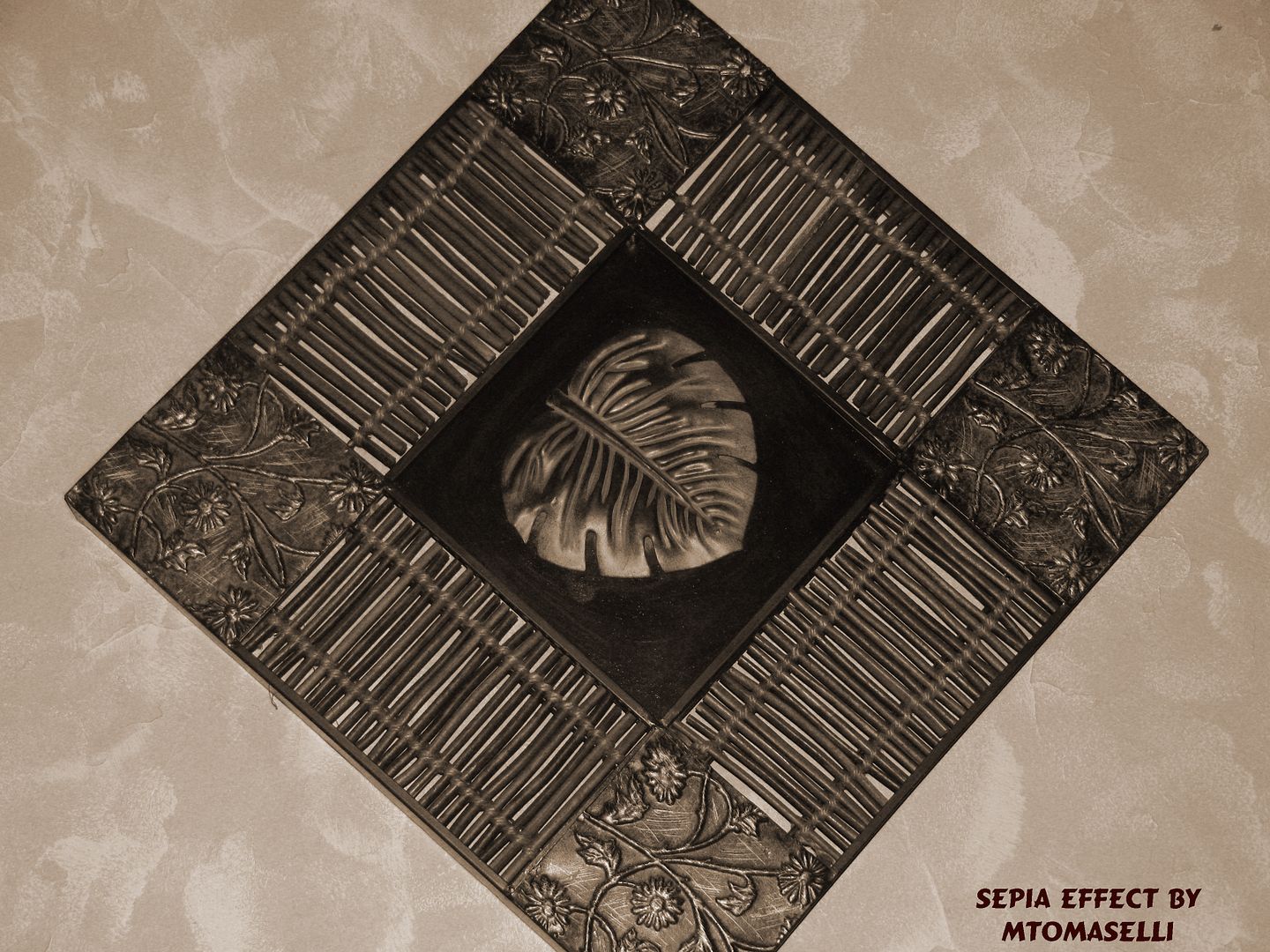

This is a piece of art that I saw in an Italian restaurant on New Year's Day. I thought it would look great with a sepia tone, so here it is.
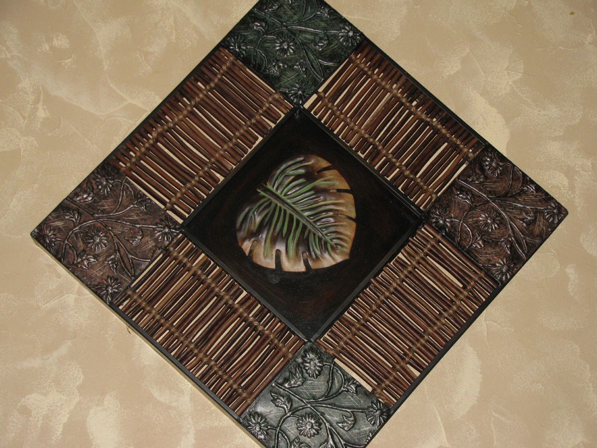
See the original photo below:

It's also very beautiful.

Please visit your fellow Sepia Scenes posters. We're all proud of our posts and would like others to see them. :)

28 comments:
You were right! It does lend itself rather well to sepia toning. Nice piece of work either way though.
Both the original and the sepia version are beautiful! :)
The beauty of this subject is the complexity of materials. Maybe it is one, but I see bamboo, with copper sheathing and tin. The myriad details are stunning and I see a depth all around. Nice in either view, the sepia tone makes it look even richer. Nice choice of subjects!
Both look wonderful but I love the splash of color in the original.
They are lovely both. Suitable in sepia.
Very interesting tile. Looks good both ways. MB
It was almost sepia before conversion. I do like the colors in the color print--but the plate lends itself well to sepia.
indeed! thats so beautiful :)
Very beautiful! but I think the original shows more details like the aging in the verdigris or am I mistaken. Gorgeous picture.
It's gorgeous in sepia, MaryT! Looks greatnatural as well.
Love you 'sepia scenes' bench icon - very creative with the lettering!
And your sepia-ized art is great, love the relief textures in it.
I have a blue-tinted sky sepia scene today ~ of the beach (wish there was a warm beach out there today to go take pictures)!
Beautiful! I agree with casasosegado, though, the original might be just as lovely. Great picture.
Lovely. Looking beautiful.
Interesting piece of artwork and it works well in sepia tone. Was it hanging on the wall?
Looks good both ways Mary. Nice.
I like both the original and the sepia version ,beautiful;)
very pretty piece and lovely in sepia
That is beautiful and unique! They both look good!
Interesting, I like the one in sepia slightly more.
Happy SS!
Beautiful indeed!
My Sepia Scene is up to!
Camera Smile
Hi Mary - love the detail on yr sepia pics!!! the little one is exquisite!
Thanks so much for another great meme - much appreciated!! Mine is up - http://tobethinkingaloud.blogspot.com/2010/01/moroccan-lantern.html
Interesting wall detail. I like it a lot better in sepia.
I like the little touch of colors in the original, but it also looks great in sepia!
both very beautiful!
I'm back with a sepia scene to show you!
Junie
i'm a huge fan of sepia. i love both the orginal and sepia version!
i'm now following this group and will be adding my sepia pics. i've also started a project 365 this year and will have a "sepia series".
As always, you have some very beautiful sepia scenes. Thanks for hosting.
It's beautiful Mary! Can you believe I almost forgot to add my link again? DUH!!
Indeed, it makes a great sepia scene! And so do the trees in your header!
Post a Comment