Malverne, Long Island
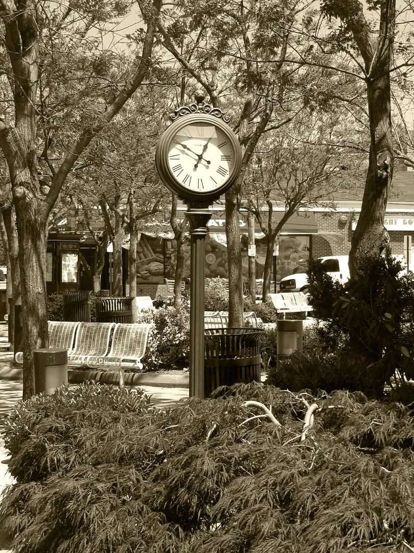
It seemed appropriate to apply a sepia tone to this modern photo of Malverne. That old clock has probably been there a long time. I used "Old Photo" from Photobucket to give it the old photo look...
It seemed appropriate to apply a sepia tone to this modern photo of Malverne. That old clock has probably been there a long time. I used "Old Photo" from Photobucket to give it the old photo look...
Welcome to Sepia Scenes this week! I will select a few of your posts to re-post here on my blog for everyone else to see. So post your best!
Don't forget to visit your fellow bloggers!
Don't forget to visit your fellow bloggers!


15 comments:
The look is of the town square or green from a century earlier. A beautiful sepia!
As a collector of clocks, this is one I would definitely like to have relocated to my front room.
Quite nice, a timeless look to it all.
I love these old fashioned clocks. They are popping up in many small towns and even Friendly's Restaurants. (Do you have those in NYC?)
Lovely Sepia Scene!
The roman numerals on the clock give it an old fashioned look and the sepia gives it age too. The picture could easily have been from an older town square. Great job!
The roman numerals on the clock give it an old fashioned look and the sepia gives it age too. The picture could easily have been from an older town square. Great job!
I just love clocks in Sepia--perfect.
what a wonderful editing :) perfect!
Lovely! Clocks are so fascinating for some reason...I love the tree[s] at the header, too!
I would be nice to have a cup of coffee in this nice area :)
Happy SS!
http://foto.rudenius.se/post/2010/05/05/Sepia-Scenes-e28093-Cathedral-University.aspx
Nice, i really like clocks, and this one was a nice pic ;)
Beautiful in sepia.
I think the clock might not be that old. The Rotary clubs around here installed three of them in the past five years or so.
Clocks work well with sepia especially clock statues and towers :)
Happy Sepia Scenes Mary!
The sepia forces us to look at the clock as the main attraction of the photo and distracts our attention from the bins that are also in there. Very well done!
It looks like "time stands still"
Post a Comment